
How to analyse your runs in KULG
One of the biggest advantages of training with KULG is that you can see the big picture of your running. It's not just about today's workout and yesterday's pace, but how your training develops over weeks, months, quarters and years.
KULG's various graphs allow you to turn your training data into valuable insights, helping you to better understand your training.
Let’s walk you through the most useful ways to analyse your data in KULG, using practical examples you can try out right away.
Start with the right time frame
Your graphs in KULG change meaning depending on the time frame you choose. That is why selecting a relevant view is the first step to good analysis. You can filter by:
Custom date ranges
Presets like This week, This month, This quarter, This year and All time
Daily, weekly, monthly, quarterly or annual grouping
On mobile the default shows This month. On desktop the default shows the last 6 months. Once you choose a preset time frame, you can move back and forth in time with the arrows to see the same period earlier in the year.
Example: Compare this year with the previous one
Switch your Dashboard to This year and then click the arrow to show Last year. The activity summary provides a quick overview of your run distance, duration and intensity for the selected year. Taking a closer look at the distance, duration and intensity graphs may identify clear patterns. For example:
A build-up of distance in spring
A peak in volume in the four weeks before your main race
A sudden drop in distance when you were ill or injured
These patterns help you understand what led to strong performances and what caused issues.
It is also useful to look at long-term changes in your heart rate vs speed ratio. A decline in this ratio can indicate increased stress or accumulated fatigue. If the ratio worsens under similar conditions, this may reflect changes in physical or overall stress levels. Possible causes can include higher training volume, insufficient recovery time, increased life stress, or the early signs of illness.
Such a decline may indicate accumulated fatigue or overtraining, although other factors may also play a role. As this measure is sensitive, it is important not to draw conclusions from a single activity, unless it is a similar type of run in very similar conditions. It is more reliable to look at weekly, monthly or longer-term trends, where meaningful patterns are more visible.
Example: Month to month comparisons
As shorter time frames show gaps, you can immediately identify days without activity. Look at the intensity chart or the pace graph:
Did my easy pace get a bit faster?
Did I run more high-intensity sessions this month?
Did my average heart rate drop for similar distances?
Did my total volume increase gradually?
The following shows the activity summary for May and June 2025. As you can see, the distance, training duration and intensity increase from May to June as you train towards the goal race in summer.

A gradual increase in volume is one of the clearest signs that you are building endurance and aerobic capacity safely. When reviewing your monthly data, check that you have included cut-back weeks every 3-4 weeks, during which the overall weekly volume is reduced. These lighter weeks help your body to absorb the training load and reduce the risk of overuse injuries.
If you experience fatigue, stagnation or early signs of injury, review your volume trends. You may notice a steep increase or several heavy weeks without a cut-back. Adjusting this pattern is often enough to make you feel fresher and see progression again.
Over several months, these small adjustments can reveal long-term progress and a healthier training rhythm.
Filter by activity type for deeper insight
In KULG, every graph can be filtered by different run types, such as race running, tempo runs and long runs. This lets you focus on exactly what you want to analyse.
Example: How are your long runs progressing?
Filter by long run and group your graph by month. You might see:
Consistent long runs building towards race day
A few months where you missed long runs entirely
The way your average pace on long runs improved as your endurance grew
The following shows an improvement in the average pace for your long runs. It was 6:02 min/km in May 2025, but you improved to 5:58 min/km in June following consistent training.


Example: Analyse race-specific training
Choose race running or tempo runs, then compare the months leading up to your race. Often, you will see:
A rise in high-intensity training
A better HR vs speed ratio meaning you can run faster at a similar effort
Stronger consistency in feeling or perceived effort
These clues show whether your training was well balanced.
Use Tags to find hidden patterns
With KULG, you can tag activities and filter graphs and lists by those tags. Tags allow you to dive deeper into your training by categorising specific types of sessions. This makes it easy to compare similar runs and spot patterns that would otherwise be missed.
Example: Compare your weekly long run routes
Name each long run after the route, for example “seaside run” or “forest trail run”. Then filter by that tag and look at the pace or heart rate graph. You will quickly see:
Which routes feel easier
Where your heart rate is consistently higher
Whether your pace improves on the same loop over several months
This helps you understand where your aerobic fitness is changing.
Example: Analyse your shoes
Create tags for your shoes such as “Nike Vaporfly”, “Adidas Boston” or “trail shoes”. Then filter your activities by each tag to check your distance, pace and feeling graphs for that shoe.
You will be able to answer questions like:
Do some shoes lead to a higher average pace on the same route?
Are you mainly using certain shoes for long or easy runs?
Does your perceived effort increase when a pair is worn out?
Over time, shoe tags can help you identify which models work best for different sessions or seasons. They also help you monitor how many kilometres you’ve run in certain shoes.
Example: Find performance trends on hill runs
Tag activities as “hills”, “short hill reps” or “long climbs”. When filtering by these tags, use either the HR vs speed or the intensity graph.
You may notice:
Stronger efficiency on climbs as your fitness improves
A pattern of high-intensity weeks before races
Whether you need to include more hill work in your training block
Hills are demanding, so filtering for them shows exactly how they impact your fitness.
Example: Compare solo runs vs group runs
Tag your running club activities with “group run” or similar. Then filter by this tag and look at feeling, pace or heart rate.
This often reveals:
Group runs tend to be either faster or significantly slower than intended
Your heart rate may be higher at times because of chatting with other runners
Your perceived effort may be lower during group runs due to the social aspect
Such trends help you balance training stress and avoid accidental overtraining.
What you can learn from each graph
When you filter by time frame and activity type, each KULG graph starts to tell a story.
Here is what to look for:
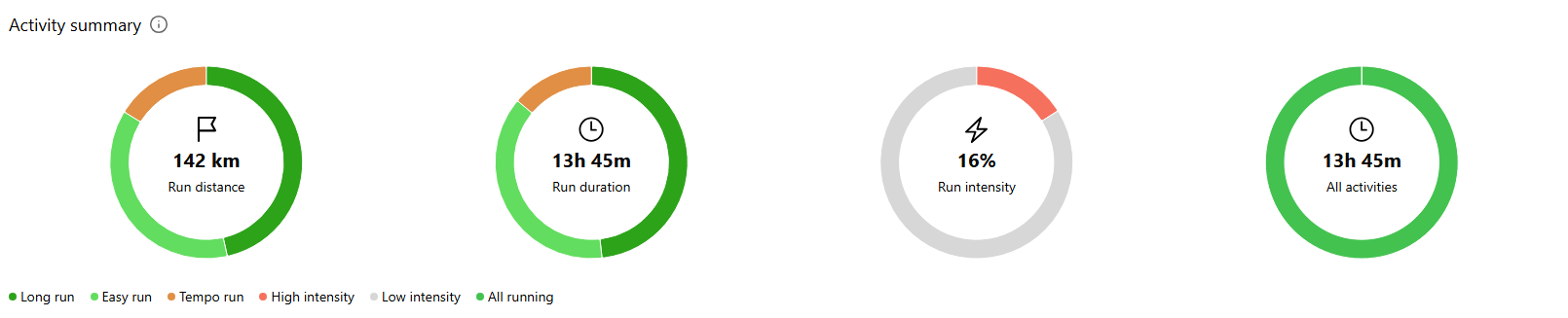
Activity summary
Shows total distance and duration of your runs, your mix of easy and hard intensity, and how your time is split between sports. This is great for checking if your training aligns with your goals.
Distance
Shows how your total monthly or weekly distance changes. Look for steady growth, build-ups in the lead-up to races, and sudden drop-offs due to illness or injury.
Pace
Shows your average running pace. When viewed over a period of months or quarters, you may notice an improvement in your easy pace as your fitness increases.
Heart rate
Shows your average and maximum heart rate. This is useful for spotting fatigue, overtraining or fitness improvements.
HR vs speed
Shows how efficiently you run. A higher value means that you are running faster at a similar heart rate. Compare this graph quarterly or annually to see long-term progression.
HR zones
Shows the proportion of time you’ve spent in each of your five heart rate zones over a selected custom or predefined time frame. This helps you understand how hard you’ve been training and whether your training load is balanced.
Duration
Shows how long your runs are. This is helpful for seeing how your long runs develop and how consistent your training weeks are.
Intensity
This shows the distance covered at high and low intensities. Check this graph monthly or quarterly to make sure you're not pushing yourself too hard.
Feeling
Shows your average feelings and perceived effort. Correlate this with changes in distance or intensity to understand the effect of training load on well-being.
Sleep
Shows the quality of your sleep before your runs. This is a valuable factor to consider when analysing periods of good or poor performance.
Recovery
Shows resting heart rate and HRV trends. Ideal for gaining long-term insight into training load and recovery balance.
Bringing it all together
KULG's real power lies in comparing the same data in multiple ways. For example:
View your distance and intensity graphs quarterly. Do they rise at the same time, or did intensity peak before distance?
Compare your HR vs speed chart monthly or annually. Is the trend improving?
Filter out only tempo runs and look at pace. Did your tempo pace drop in the summer due to the heat, or did it increase thanks to your improved fitness?
Look at your feeling and sleep graphs during your highest volume month. Did you handle the load well, or did you experience excessive fatigue?
These patterns show you what works and what needs adjusting.
KULG lets you understand your training in more depth than a single workout can show. By adjusting time frames, filtering activity types and using tags, you can turn your dashboard into a powerful tool for long-term progress. Whether you are preparing for a big race or trying to recover from injury, KULG helps you to see what really happens behind every kilometre.